
Reading Pokémon card price history

One price is a snapshot; the chart is the story. Comparing 30, 90 and 365 day views tells you whether a card is genuinely appreciating, briefly spiking on hype, or drifting down while a single optimistic listing holds the headline number up.
What each time range is good for
The 30 day view shows current conditions and reacts to news, tournament results and reprint announcements. The 365 day view shows the underlying direction and smooths out the noise. When the two disagree, the longer view is usually the more reliable guide.
The 90 day view sits in between and is the most useful single chart for deciding whether to sell now or hold.
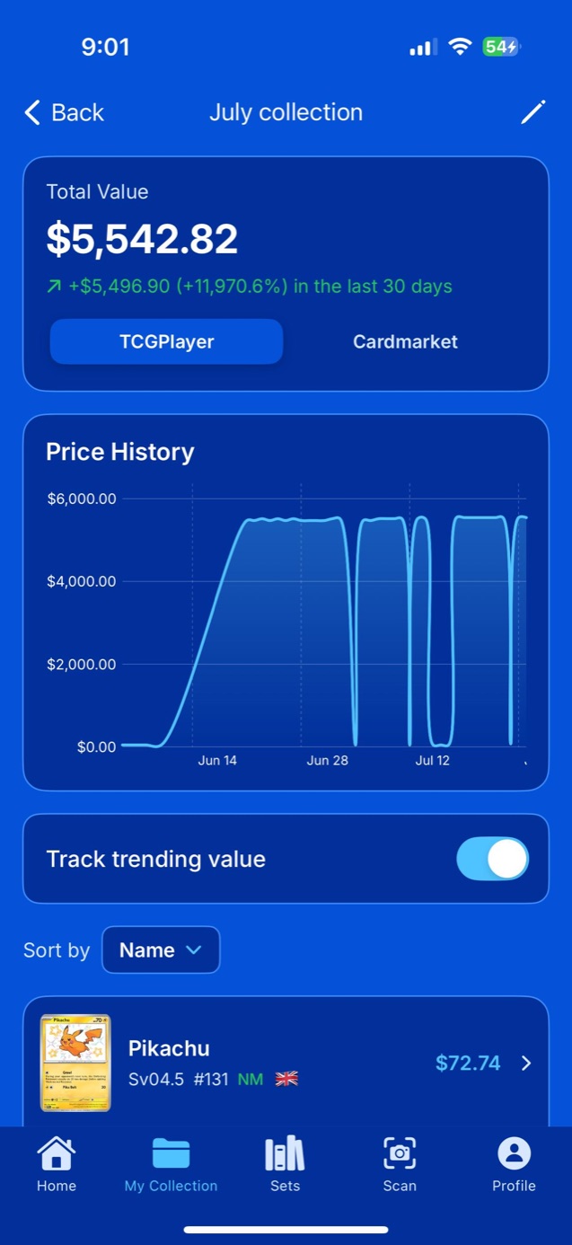
Spotting a spike
A vertical rise followed by a flat plateau usually means one expensive sale rather than sustained demand. Genuine appreciation looks like a gradual slope with many transactions behind it.
Reprints are the most predictable price event in the hobby. When a popular card is announced for a new set, the original tends to fall in the weeks that follow as supply expectations change.
Questions
How far back does price history go?
Card Catcher shows 30, 90 and 365 day ranges, which covers a full year of market movement for any card in the library.
Do prices update in real time?
They refresh from live market data rather than a fixed snapshot, so the figure you see reflects recent sales rather than a stale cached value.